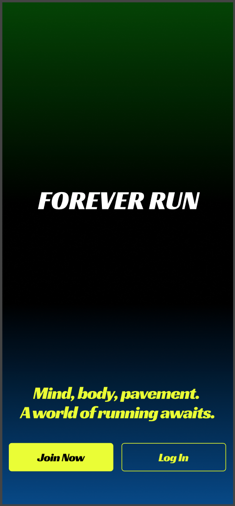
FOREVER RUN

Pic of people running a marathon
Client
Forever Run
Project Type
Redesign & Handoff
Role
UI/UX Designer
Project Year
2025
tools
Figma - Adobe Color - Google Fonts
Description

We were working with the team at Forever Run.
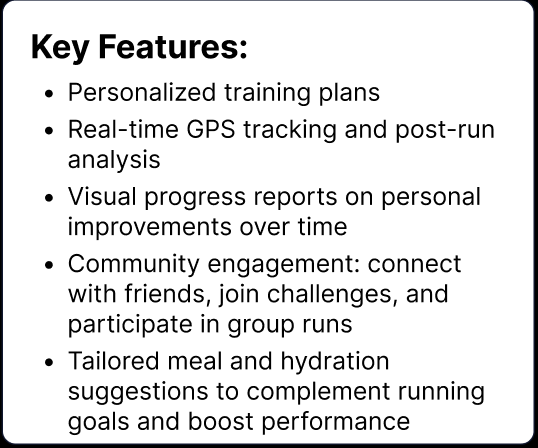
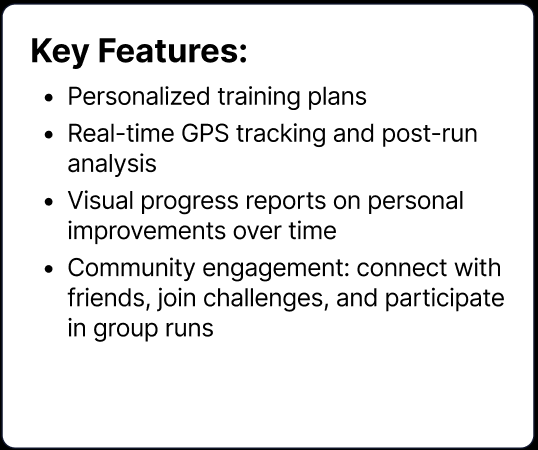
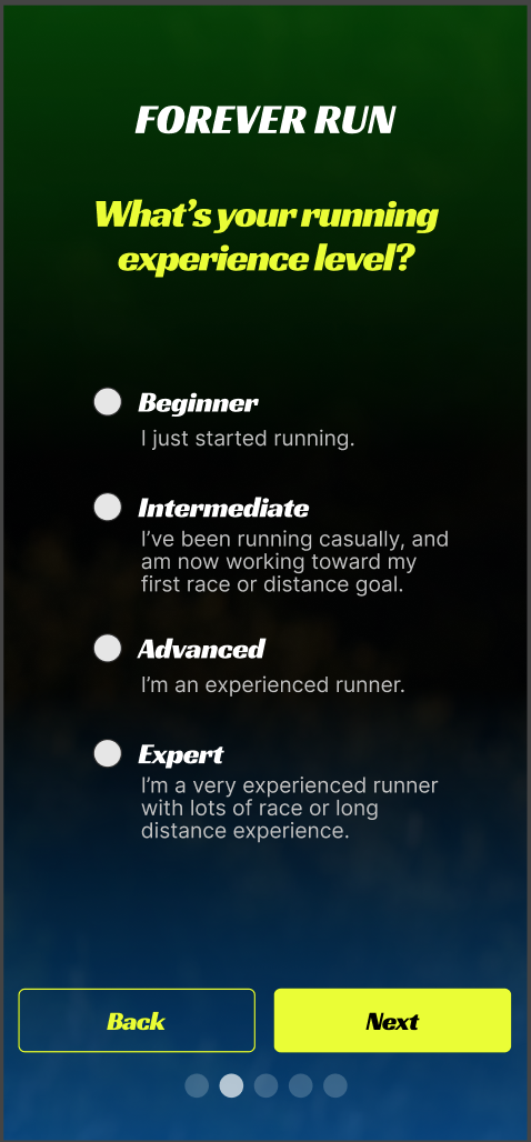
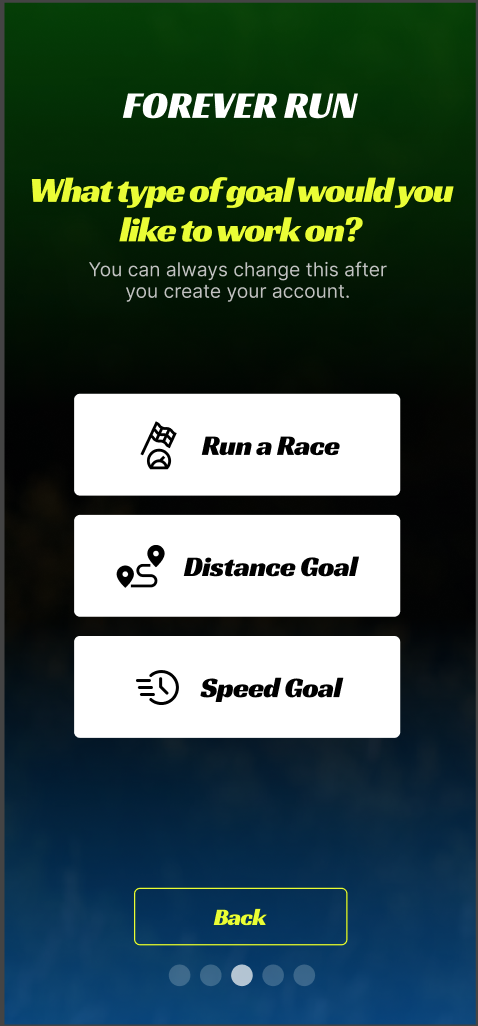
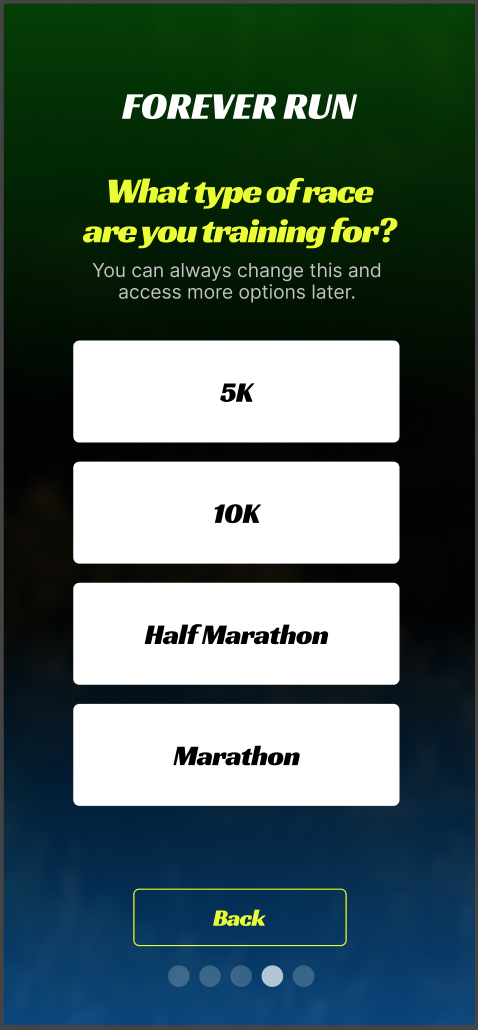
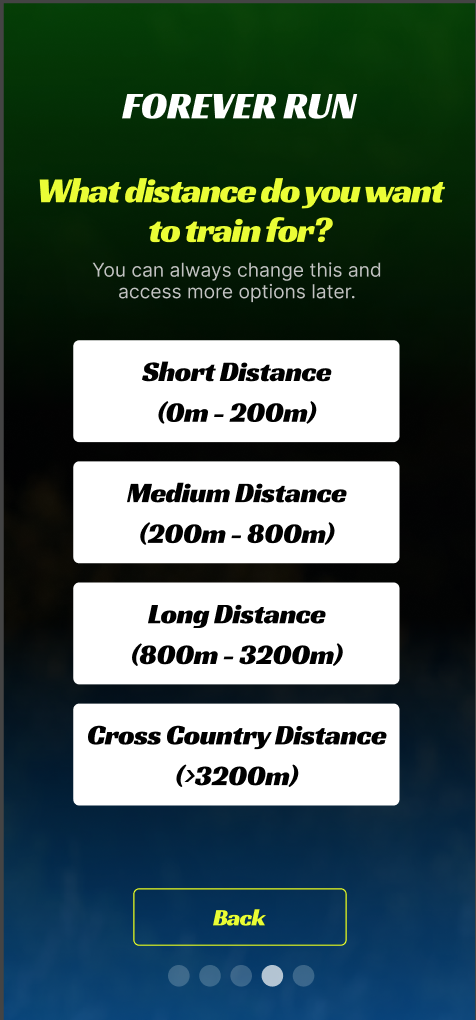
They were shifting the emphasis of their mobile app. Instead of focusing broadly on all types of runners, they would be focusing specifically on runners training for their next race or goal.

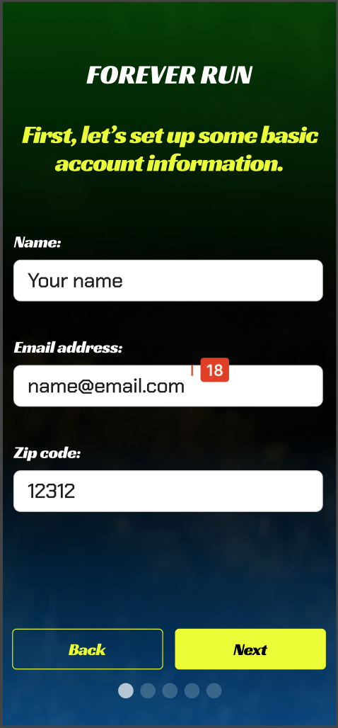
The product team had already created a new product brief outlining the new product requirements. The project was then, in my hands.

DeTAILS

App Redesign - Team Collaboration Handoff - Prototyping

Problem

Problem Statement & Context
In this project, we would concentrate on the app's refocus, redesigning the onboarding screens for the Forever Run mobile app, all while annotating our work for a smooth handoff to development.

Research & Key Insights

First we take note in the differences in the app's Overview.
The app will take its focus from runners of all levels to runners that are training specifically for their next race or goal.
original overview
new overview
The Problem Statement remains the same.
Runners struggle to track progress accurately and easily, and follow tailored training plans, all while staying motivated.
problem statement
We see only the slightest shift in our Target Audience.
We go from runners of all levels, aged 18-45, looking to track progress to runners of all ages looking to track progress towards specific race goals.
original target audience
new target audience
Only 1 major change to the Key Features.
Tailored meal plan suggestions have been cut out.
original key features
new key features
Objectives & Metrics have stayed the same.
Design Specifications have remained the exact same as well.
metrics
design specs

Design Process

Original Design!
Since this was a total redesign, we were able to add, remove, and swap out whatever we needed as we saw fit.
We took the approach of lining up each original screen in order, copied each, then aligned the copy next to the original for reference. We could then make the needed changes to our new screens.

We also included our list of detailed changes so that we could also include them in the Developer Handoff File.
old flow 1
new flow 1
what we did 1
old flow 2
new flow 2
what we did 2
old flow 3
new flow 3
what we did 3
Separating the Experience Level screen left us with a newly distinct Goal Type screen.
new flow 4
what we did 4
The Goal Type screen had 3 unrelated selections which called for 3 new screens.
new flow 5a
new flow 5b
new flow 5c
what we did 5
All of our new Goal screens leads to the Lets Go screen
old flow last
new flow last
what we did last

Solutions

This is our Finished Design
Finished Design

Impact & Results

It's possible that general runners may be the ones losing out from this redesign. However, this redesign will really hit home for the runners racing towards their next finish line!
Runners will still be able to track their progress, but now they will also be able to stay motivated with their training by connecting with a community of individuals trying to achieve the same goals vs struggling through it alone.

The result was a totally redesigned run appliation! We hope the results are fully satisfied users!

Lessons & Next Steps

The 1st lesson I was reminded of was to definitely notate every single change that you make for the Development Handoff File. Having to remember something, and trying not to forget anything, is very nerve-racking and not worth the sweat.
Another lesson was to remain cognizant of sticking to the design specifications even when you have other ideas.

Some of the next steps will be to answer the question of whether we've hit our metrics goals or not. We'd use research and user testing to figure out what worked & what didn't & why and recalibrate from there. Reiterate!
Back to Top