I wasn't provided any specific research/user feedback other than that many users were "struggling" with the flow.
I did execute a personal user test by attempting to complete the flow, to immerse myself into the problem.
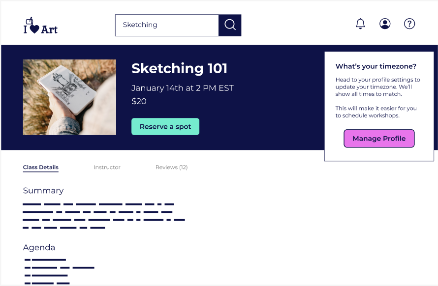
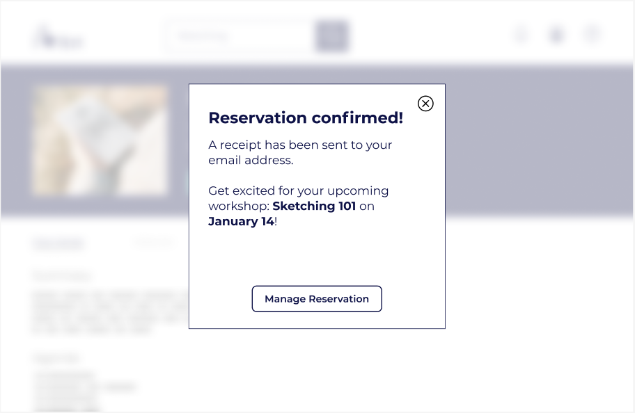
Flow A
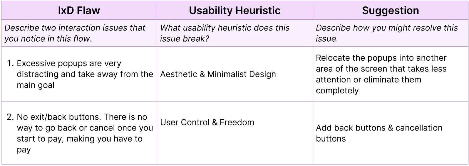
OriginalThe 1st usability flaw that we noticed was a bombardment of popups upon pressing the "Sketching 101" block. This is a violation of the usability heuristic principle "Aesthetic & Minimalist Design".
Our first solution was to get rid of the popups completely, or secondly, we could've tried to fit the popups into other areas of the screen to eliminate distractions.
We chose to get rid of the popups completely for now, since they were irrelevant to the reservation process. We did however, send suggestions on relocating the popups to other pages or sections.
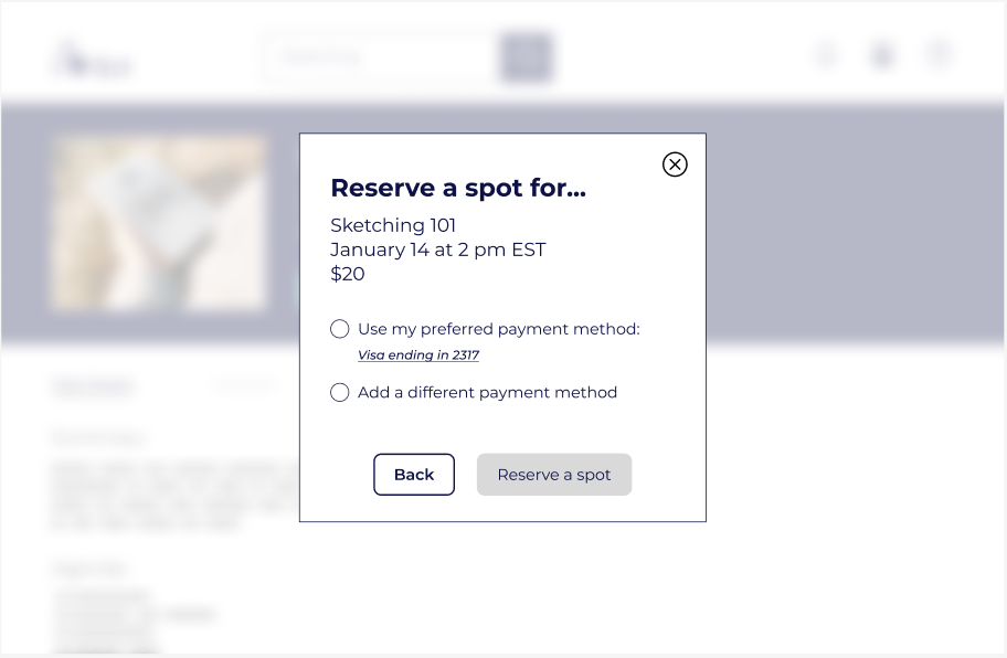
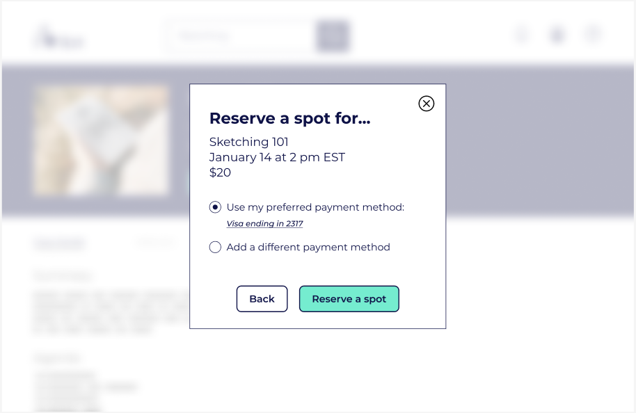
The 2nd flaw we found was the absence of any type of cancellation or back-out method within the reservation process. This was a violation of the usability heuristic principle "User Control & Freedom".
Our obvious solution was to add some type of cancellation methods, so we did.