Upward Spiral
Client
MLP Music Group
Project Type
Visual Design
Role
UI Designer
Project Year
2025
tools
Figma - Adobe Color - Google Fonts
Description
Local fictional electro-pop band Upward Spiral had grown to worldwide fame after one of their albums went 10x platinum.
Accelerated fame, and a flourishing fanbase had pushed the music label MLP to create an official website for the band. MLP had brought us on board to help build out their band's website.
The purpose was to promote their music, announce tour dates, share their origin story, and of course sell merchandise.
DeTAILS
Wireframing - Color Design - Typography
Problem Statement & Context
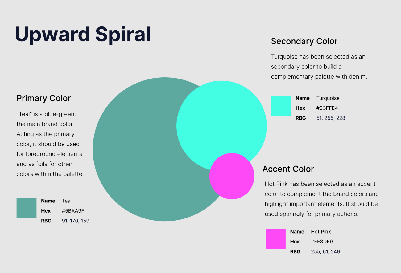
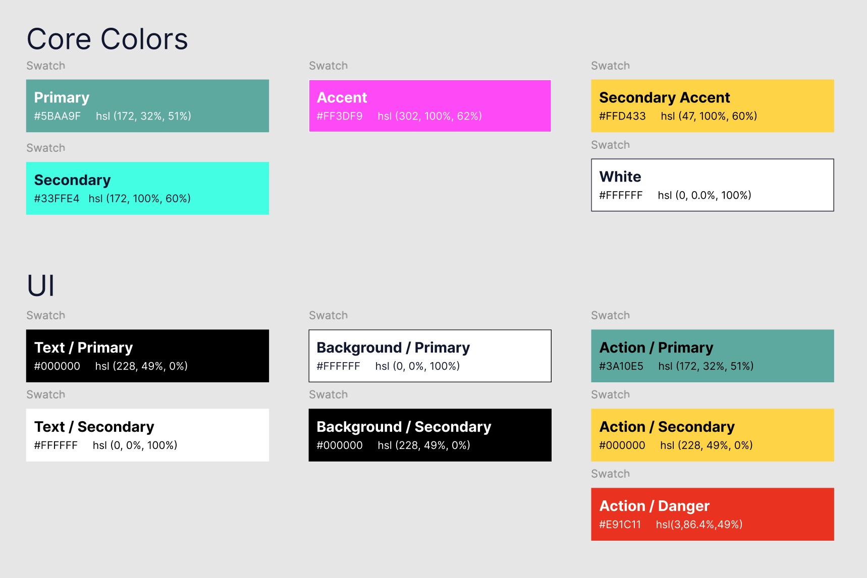
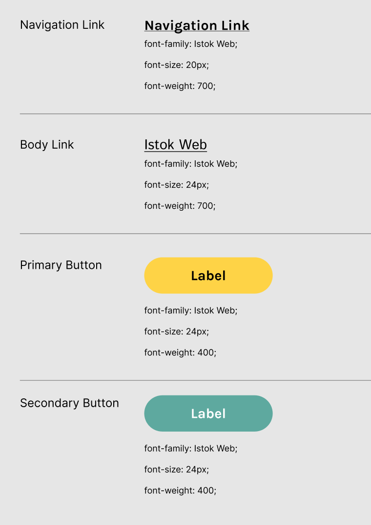
The longtime popular MLP Music Group had asked us to work on the visual design for their record-smashing band’s new website. They wanted the visual design of the website to be organized and coherent as well as effectively use visual design principles. We were to choose the primary, secondary, and accent colors for the website, along with developing the color palette and associated color styles. Lastly, we were to create and apply a type style guide that conveys the band’s music, style, and message.
We were to create a Mid Fidelity workup of the website!
We broke this project up into 3 parts
- Layout - Analyze other like websites for inspirational reference. Create layouts that use visual design principles
- Color Design - Choose the primary, secondary, and accent colors for the website. Develop a color palette along with color styles. Finally, apply color palettes to mid-fidelity wireframes
- Typography - Create a type style guide. Apply styles to wireframes
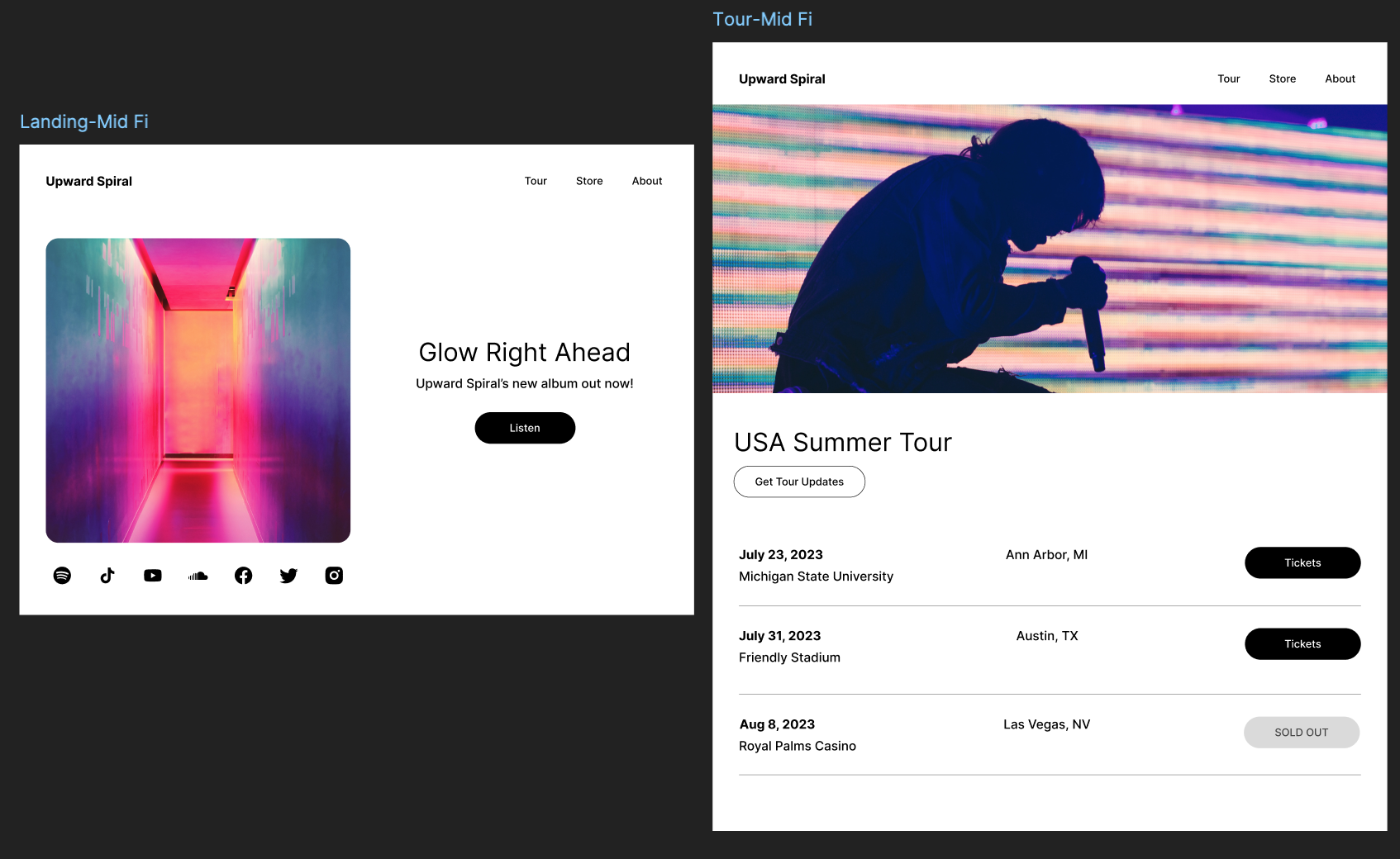
We Designed 4 Main Pages
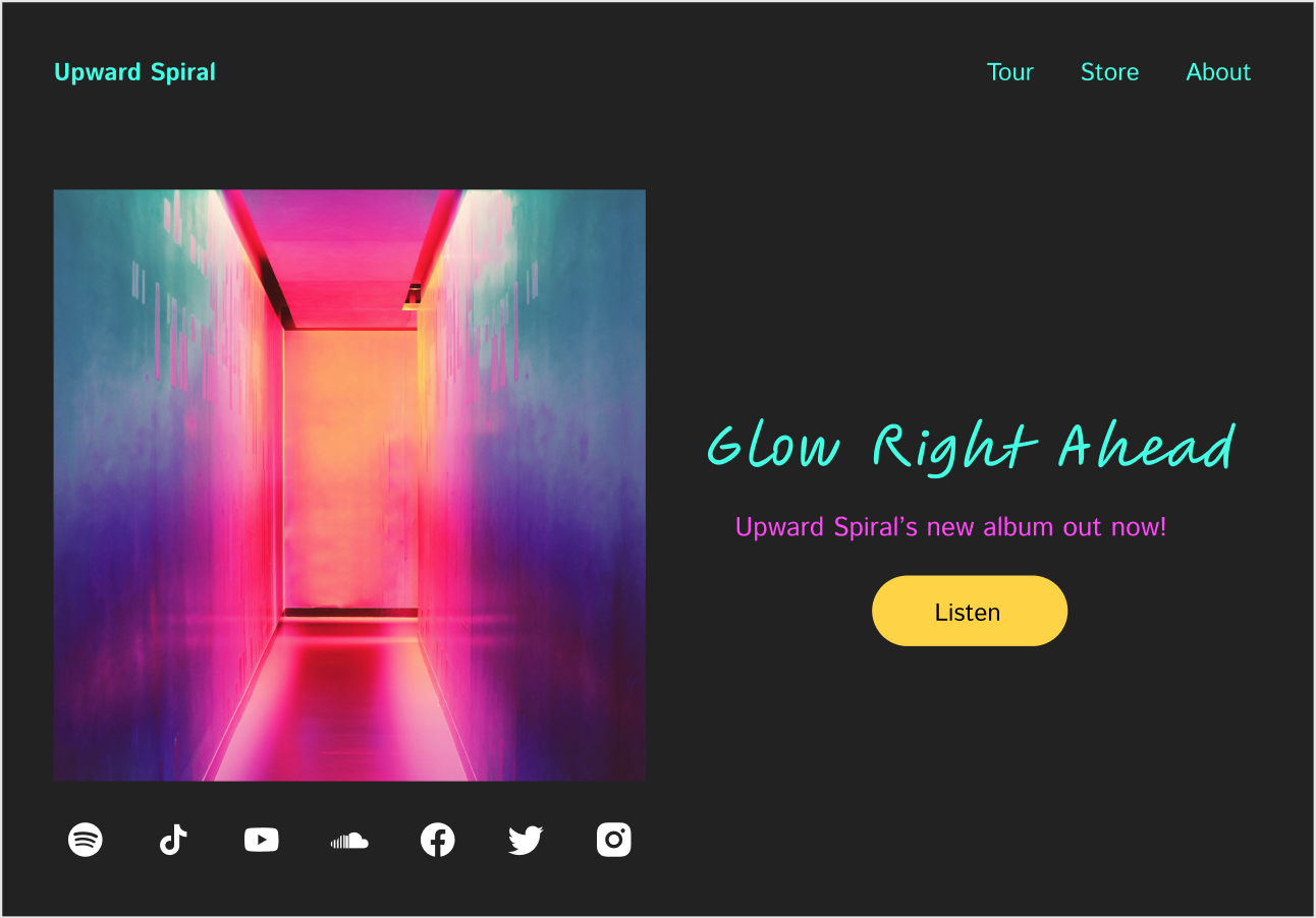
- Landing Page - Home page that promotes the band’s music
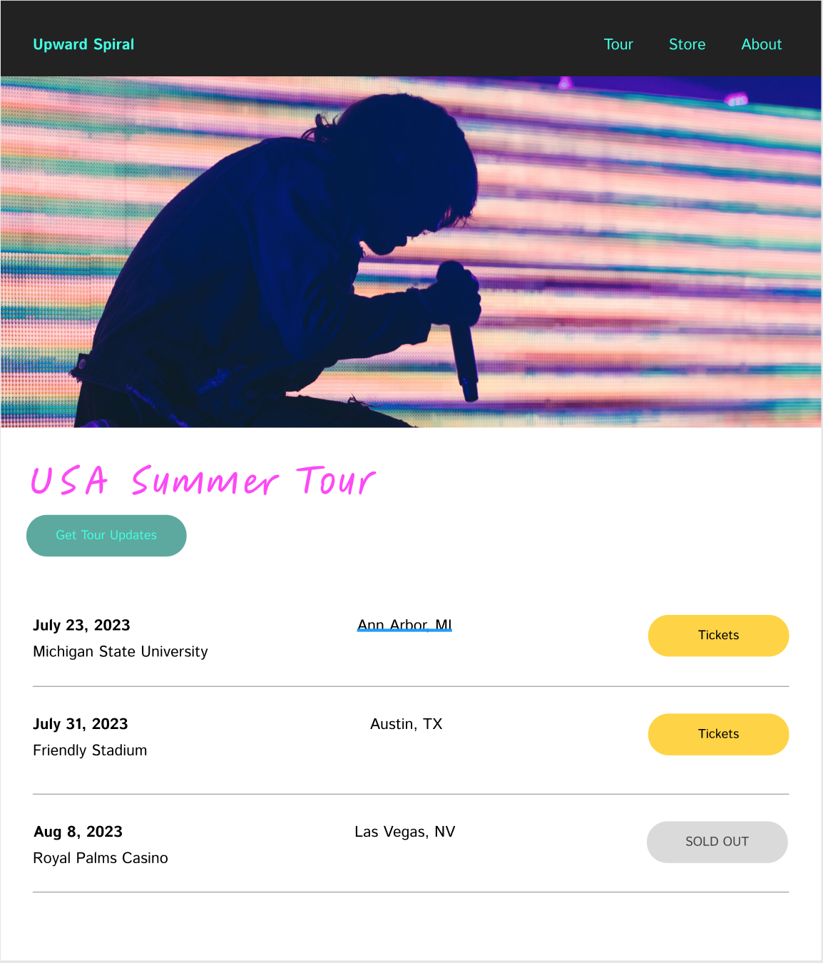
- Tour Page - Shows tour dates, locations, and a way to buy tickets
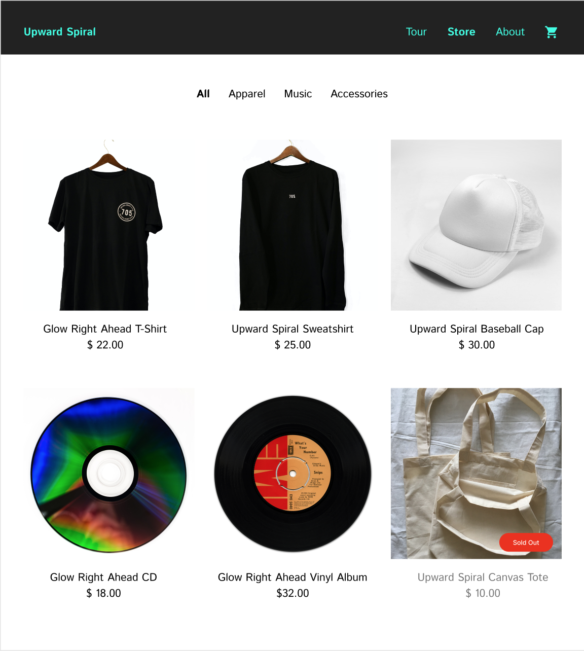
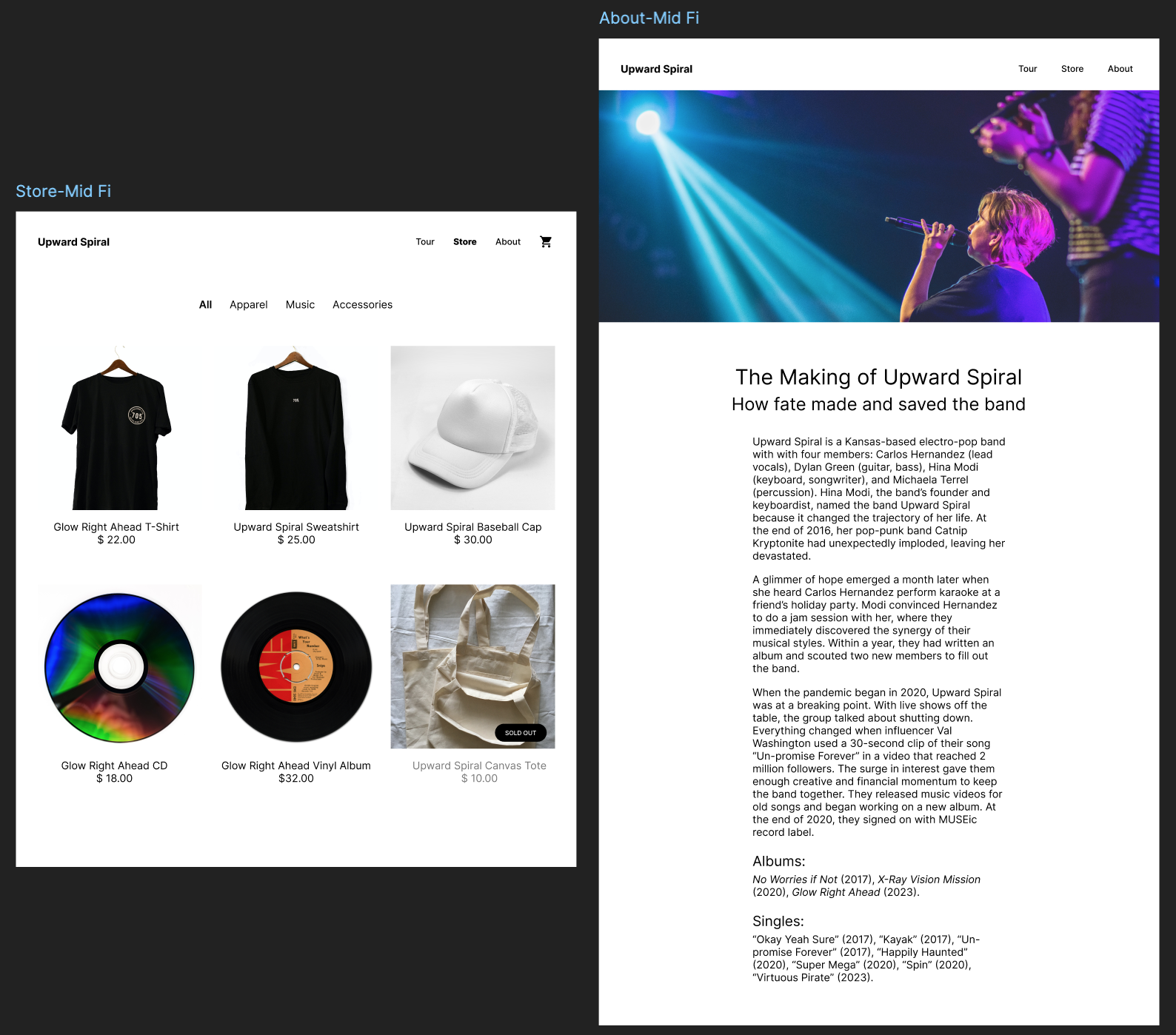
- Store Page - Advertises band’s official merchandise
- About Page - Shows band’s biography
- Navigation bar with a logo and links for the other pages: Tour, Store, About.
- Album name and/or artist name
- Social icons: Facebook, Instagram, Spotify, Soundcloud, TikTok, YouTube
- Image of band or album
- Navigation bar
- Tour info: date, venue or event title, location
- Button to purchase tickets
- Inactive button for sold out shows
- Navigation bar with cart or bag icon
- Photo of merchandise
- Product description and price
- Filter options for categories of merchandise: All, Music, Apparel, Accessories
- Navigation bar
- Text: fictional biography for the band
- Title (such as “About”)
- Image(s) of the band
This project did not include any research.
No previous insight was available as this was a 1st build. After the website has been launched, we will be able to initiate research methods to find out what could be optimized.
We received inspiration from similar musical websites such as Apple Music, Spotify, and Pandora. All the websites that we referenced were similar, so we assumed that the layouts they used were probably the best options. We pulled elements from all references to create our Low Fidelity Wireframe, making sure to add everything that was asked for.
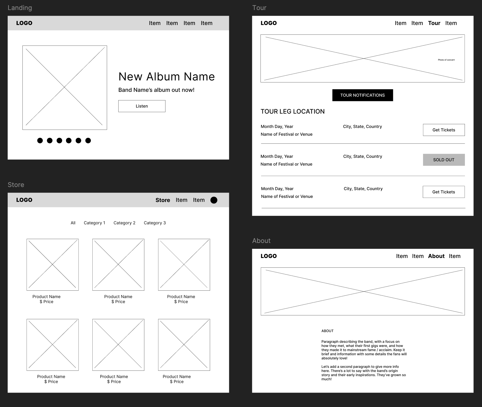
After completing a low fidelity wireframe, we proceeded to add some pictures of the band, tour info, band info, and fan merchandise item info that we received from the record label. We also concentrated on the button styling during this stage. To complete our Mid Fidelity Wireframe, we corrected all picture aspect ratios, element alignments & element spacings.
After a mid fidelity wireframe was built, we had to color it. The fun part! We used Adobe Color to brainstorm many different color schemes and combos. We were trying to capture a soft & dreamy theme in which defines our electro-pop band's style.
Adding to the color, we again had to play off of the band's style by adding a fun font. We used Google Fonts to brainstorm many different type styles and pairings. We went with a fun & curvy font theme.
Now the band has a website that serves as a link between them and their fans.
The website will serve as a hub to promote the band's music. Fans will be able to listen to, download, or buy the band's songs & albums.
It allows the band to announce tour dates, give updates & announcements about specific shows, and provide ticket sales.
The website is a perfect place for the band to share their origin story as well as share their adventures throughout what's to come.
The store page allows the fans a direct memorabilia store, rather than having to search randomly online. It will increase sales as it will provide a place to find all band merchandise, old and new.
This project was a perfect example of NOT trying to re-invent the wheel. Being able to reference other similar websites was a very successful practice as well as a major time saver.
One nerve-racking task was being responsible for capturing the band's style & essence, using colors & fonts.
The next steps will be to add interaction to the pages, make them connect, clean them up, and turn them into High Fidelity versions that will eventually launch as a brand new website.
In the future, research and user testing can be done to define what needs optimizing. Since it is built like other successful musical websites, optimization should be minimal.
Back to Top